case study
Campaign Development Collaboration, Logo Exploration, and Illustration for platinum-resistant ovarian cancer (PROC) Disease State Education

-
A disease-state education initiative designed to increase awareness and understanding of platinum-resistant ovarian cancer (PROC) among healthcare professionals (HCPs).
PROC is a rare and aggressive disease with limited treatment options and evolving clinical research.
We created Illuminate PROC to provide clinicians with a centralized destination for disease-state education, emerging scientific insights, and resources. -
Collaborated with a cross-functional creative team developing the HCP DSE campaign, while exploring the visual identity, illustrating the iconography system, and other supporting visual assets used throughout the experience.
-
Healthcare professionals navigating complex oncology landscapes are often required to absorb large volumes of rapidly evolving scientific information.
Embodying scientific credibility, efficient information processing, content discoverability, and consistency across educational materials, is a delicate balancing act.
-
Clarity improves engagement. Educational platforms are more effective when complex information is organized into intuitive and easily navigable systems.
A cohesive visual system can help reduce cognitive burden and improve information accessibility.
Scientific communication doesn't need to feel cold. Visual design can reinforce credibility while still creating a warmer emotional experience for HCPs, who are typically targeted using a more clinical approach to design.
Distinctive design makes for unforgettable experiences. A differentiated visual identity can help educational resources stand apart within a saturated oncology information landscape.
Experience design system
visual IDENTITY
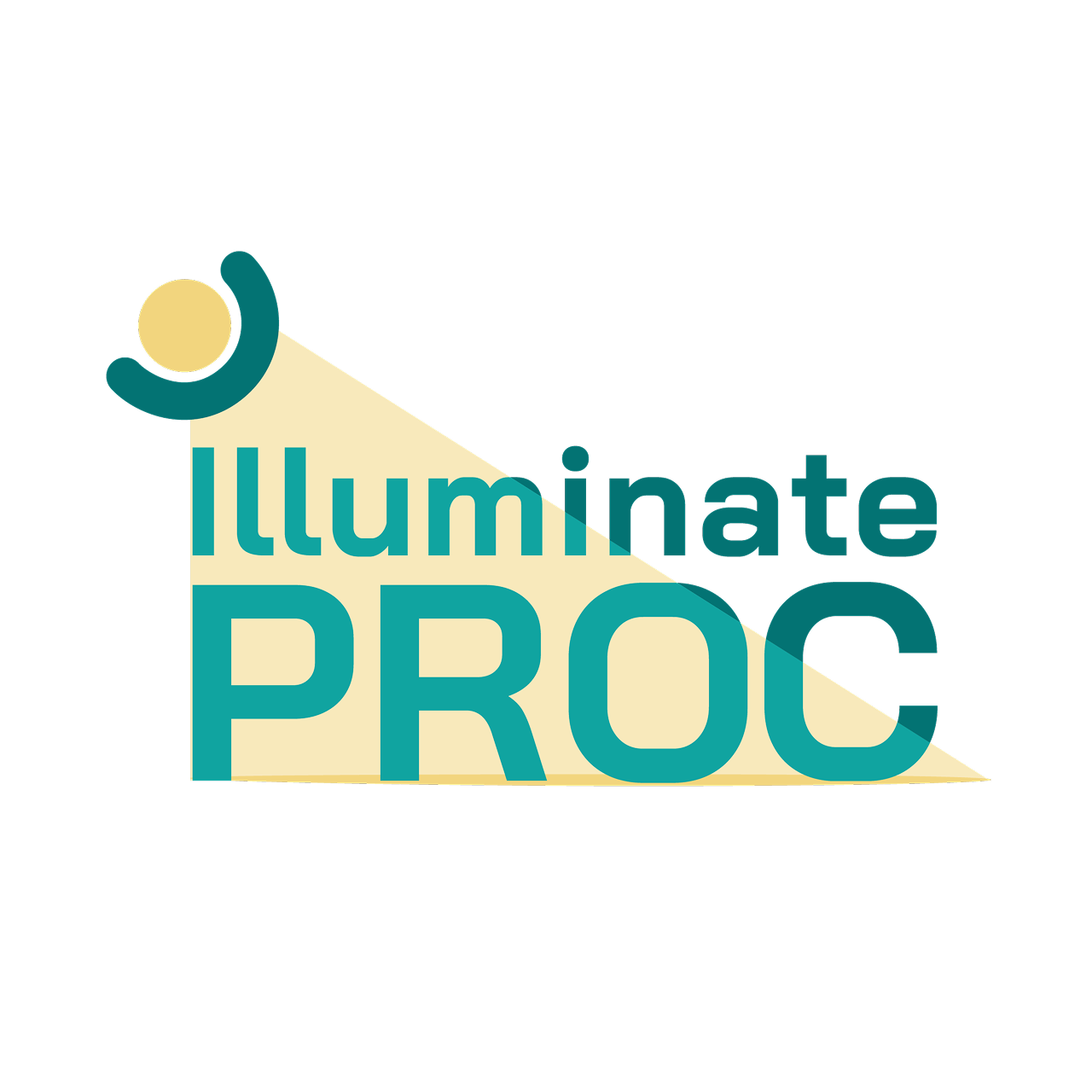
The logo design and overall look-and-feel is centered on illuminating a lesser-known disease state and creating a recognizable identity for Illuminate PROC. The mark above the “i” is an abstraction of a cortisol receptor, combined with a spotlight, representing scientific discovery, visibility, and knowledge-building.
iconography
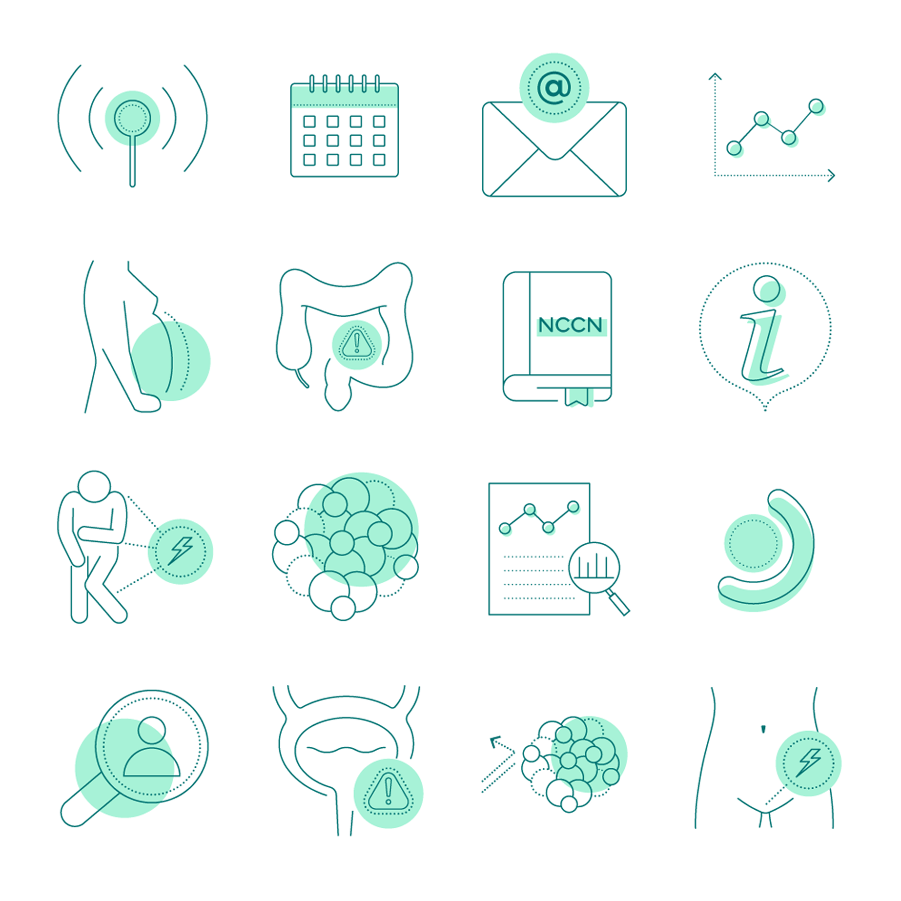
The icon library utilizes a contemporary line-based illustration style with a duotone, off-register printing effect. This layering of elements represents the complexity of the disease state. The style balances scientific authority with accessibility, creating a distinctive visual experience tailored to a highly specialized audience.

outcome
The initiative established a cohesive disease-state education platform designed to support awareness and understanding of platinum-resistant ovarian cancer among healthcare professionals. Through a unified identity system, custom iconography, and consistent visual communication framework, the platform helped translate complex scientific information into a more organized and accessible educational experience.
REFLECTIONS
My approach to visual exploration and communication focuses on:
building scalable and engaging visual systems
supporting learning through thoughtful information design
balancing COMPEXITY OF THE DISEASE STATE with WARMTH AND accessibility
ready to do work that feels like play?
For partnership inquiries, or to set up a 30-minute Chaos to Clarity session, fill out the form below and we’ll find the path forward, together.